Companion to Chapter 5. Chapter 5 teaches the discipline of removal — Tufte’s data-ink ratio applied as an operational routine: strip chart elements one at a time until the argument degrades, then restore the last element cut. Combined with the pre-attentive-attribute rule (use color, size, or position once to direct where the eye lands first), the removal discipline turns a Copilot default with legends, gridlines, redundant labels, and full-color palettes into a chart whose one load-bearing element carries the Big Idea. This page carries what the book cannot: curated further reading beyond Appendix C on data-ink and visual attention, a five-question self-check quiz on the removal discipline, and a hands-on activity that runs remove-until-it-breaks against a Copilot dashboard.
Use the further reading to see the data-ink discipline in its original form (Tufte 1983) and its softer working-analyst forms. Use the quiz to check whether the removal-and-restore pattern has moved into reflex. Use the activity to feel the discomfort of stripping a chart until it almost breaks.
Further reading
Books and articles beyond the book’s own bibliography (Appendix C, updated in errata) on the data-ink discipline and the perceptual mechanisms that make removal work.
- Tufte, E. R. (2001). The Visual Display of Quantitative Information (2nd ed.). Graphics Press. The canonical treatment of the data-ink ratio — the primary source Ch 5’s discipline compresses. Chapters 4 and 5 («Data-Ink and Graphical Redesign,» «Chartjunk») are the direct pairing. Read Tufte to understand the principle in its uncompromising original form, then read Ch 5’s working softening («some non-data-ink earns its place if it helps the audience read faster») as the operational compromise.
- Ware, C. (2020). Information Visualization: Perception for Design (4th ed.). Morgan Kaufmann. The perceptual-psychology textbook underneath the pre-attentive-attribute rule. Chapter 5 («Visual Salience and Finding Information») covers exactly how the visual system uses color, size, and position for pre-attentive processing — the mechanism the «one pre-attentive attribute per chart» rule leverages. Long book; the chapter references above stand alone.
- Knaflic, C. N. (2015). Storytelling with Data. Wiley. Chapter 3 («Clutter is your enemy!») is the operational form of the same removal discipline, taught with dozens of before-after examples. Knaflic’s framing («every element on the chart must earn its place») is the working-analyst version of Tufte’s data-ink ratio; the two together triangulate the practice.
- Kosara, R. — eagereyes.org. Practitioner-researcher blog on visualization design, run since 2006 by a Tableau research fellow. Kosara has written extensively on chartjunk, embellishment, and when decoration helps versus when it hurts — the exact tension Ch 5’s softening addresses. Read the archive on chartjunk at eagereyes.org.
- Bateman, S., et al. (2010). «Useful Junk? The Effects of Visual Embellishment on Comprehension and Memorability of Charts.» CHI ‘10 Proceedings. The empirical study most cited for the counter-position — that some embellishment aids memorability without hurting comprehension. Useful for understanding why Ch 5 does not enforce a pure minimalist rule. Available via doi.org/10.1145/1753326.1753716.
Last curated: 2026-07-18. Reviewed quarterly. Suggestions welcome via the errata page.
Self-check quiz
Five questions on Ch 5’s load-bearing concepts. Answer them out loud before opening the reveal.
-
Q1. What is the data-ink ratio, whose principle is it, and what is Ch 5’s working softening of it?
Show answer
Tufte’s (1983) measure of the proportion of chart ink that encodes data versus decorative or redundant ink. The pure principle is «maximise data-ink, erase everything else.» The working softening in Ch 5: some non-data-ink earns its place by helping the audience read the data faster — a subtle gridline that aids alignment for a comparison, a single annotation that names the takeaway. The ratio is a target, not a rule; the removal discipline is what keeps the target load-bearing without turning it into aesthetic dogma.
-
Q2. Ch 5 names the pre-attentive attribute rule. State it and give an example of the failure mode when it is violated.
Show answer
Use color, size, or position once to direct where the eye lands first. Used more than once, the attribute stops directing. Failure example: a bar chart where every bar is a different color from a categorical palette. Color is no longer directing anything — every bar shouts equally, so nothing draws the eye first, so the audience does not know what to look at. Fix: mute all bars to gray except the one carrying the Big Idea, which stays in the brand accent. The single accent bar becomes the pre-attentive landing point.
-
Q3. Describe the remove-until-it-breaks pass, step by step, and name what specifically counts as «breaks.»
Show answer
Strip chart elements one at a time (gridlines, then legends, then redundant labels, then non-load-bearing annotations) until the argument degrades. Then restore the last element removed. «Breaks» means the Big Idea from Ch 3 stops landing — the colleague cold-read test fails, or the reader cannot orient without the removed element. Not «looks empty» and not «makes me uncomfortable.» Discomfort during the strip is normal — a chart with more chart-junk than the audience needs feels normal because that is what most Copilot defaults look like.
-
Q4. The chapter pairs the removal pass with a fresh-reader verification. What is it, why does it need to be a colleague and not the analyst, and what does it catch?
Show answer
The colleague cold-read test. After the strip, hand the chart to a colleague who has not seen the earlier drafts and ask what the load-bearing takeaway is. It has to be a fresh reader because the analyst’s eye has been on the chart long enough to see what they meant to say, not what a stranger actually reads — a form of what psychologists call the «curse of knowledge.» Catches: an element was removed that the analyst was mentally supplying, the load-bearing takeaway drifted during the strip, or a Big-Idea-adjacent claim now reads as the primary claim.
-
Q5. The chapter names a specific observed pattern about Copilot’s default behavior on chart density. What is it, and what does the pattern imply for the Refine step of the CSAR loop?
Show answer
Copilot defaults toward density — it preserves legends, gridlines, redundant labels, and full-color palettes unless explicitly directed to remove them. Implication for Refine: directions naming what to remove work more reliably than directions naming what to keep. «Remove the legend; move the data labels to the ends of the bars; mute the categorical palette to gray except the top bar» is a Refine direction the model reliably follows. «Keep it clean» is not — it under-specifies what to strip and leaves the density defaults in place.
Tomás’s governance dashboard, decluttered, up close
The dashboard on the left is what Tomás built on Friday afternoon: fifteen visuals, every one accurate, every one in the right family, and none carrying the funding decision the CDO opens the dashboard to make. The dashboard on the right is what he ships to the audit committee after running the decluttering pass. Seven visuals; four core; three load-bearing supporting; the Big Idea rendered as the page header. The committee’s eye lands on the funding-comparison bar chart in the first landing zone.
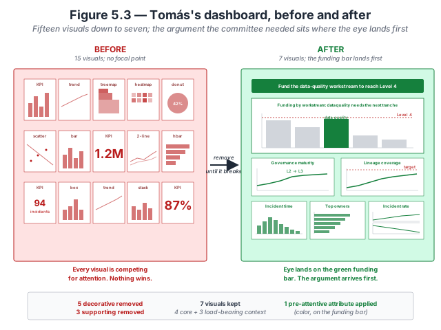
- The kept set spans four families. The rebuild is not a chart-family swap — it retains kpi_card, trend_line, heatmap, bar_chart, and table. Decluttering is about removing what does not carry the argument, not about collapsing into a single chart shape.
- Every removed visual carries a specific reason. The dataset lists all fifteen with the keep/remove verdict and the reason. Composite indices without comparison; vanity metrics; visuals that belong on a different team’s dashboard; redundant same-story pairs (donut + heatmap of the same finding shape). The reasons are the discipline.
- The funding-decision bar chart is where the eye lands first. Sorted by funding-vs-closable-gap variance ascending, with the underfunded domains accented. The audience’s decision (which domains to fund) is in the first three seconds of reading, not buried among fourteen other visuals.
- Removal creates the emphasis that addition never can. Adding highlights to fifteen visuals would produce fifteen highlighted visuals. Removing eight visuals leaves the highlighted one alone in its region of the page; the eye finds it without effort. Chapter 5 walks the discipline in Why removal directs attention.
Inspect the verdicts. All fifteen visuals with their keep/remove verdict and per-visual reason are available as a flat CSV. Download tomas-governance.csv · Dataset README and schema.
Try this activity — remove-until-it-breaks on a Copilot dashboard
This activity walks the removal discipline against a Copilot-generated dashboard. Total time: 30–40 minutes.
-
Generate the dashboard cold. In Power BI Copilot against the CloudRevenue dataset, prompt: «build me a dashboard for the sales-ops team showing Q3 services revenue by product family, region, and top ten tenants.» Accept the first output. Screenshot it.
-
Take the eight-element inventory. For the primary chart on the dashboard (the one Copilot placed largest or top-left), enumerate every visual element: (1) chart title, (2) axis titles, (3) axis labels, (4) axis lines, (5) gridlines, (6) legend, (7) data labels, (8) categorical palette bars. Rate each on a scale of «load-bearing / helpful / decorative» against the Big Idea the dashboard is arguing.
-
Run remove-until-it-breaks. Starting with the elements rated «decorative,» strip them one at a time. After each strip, ask: does the chart still argue the Big Idea? If yes, continue. Move to «helpful» elements next — strip until the answer becomes «no,» then restore the last element cut.
-
Add the pre-attentive attribute. Pick one attribute (color, size, or position) and apply it once to the element carrying the Big Idea. If the Big Idea is «services revenue is $2.3M short of Q3 plan,» the pre-attentive attribute is a highlight color on the bar showing services revenue, with every other bar muted to gray. If the Big Idea is a trend inflection, the attribute is a labeled dot at the inflection point.
-
Run the colleague cold-read test. Share the stripped-and-focused chart with someone who has not seen the earlier drafts. Ask: «What is this chart telling you?» Their sentence should match the Big Idea. If it does not, note which element you stripped that was carrying meaning the analyst was mentally supplying, and restore it.
-
Reflect (three prompts). Write one sentence in response to each:
- How many elements did you strip before the argument degraded?
- Which element did the colleague cold-read test surface as necessary that you had removed?
- How would you write the Refine direction to Copilot to reproduce the stripped-and-focused version in one shot?
The reflection is the activity’s payoff. Skipping it turns the exercise into paperwork.
Optional extension: repeat the activity on a dashboard your team shipped last quarter. The number of decorative elements you can strip without breaking the argument is roughly the maintenance debt the shipped version was carrying.
Related site resources
- CloudRevenue dataset: the dataset the activity above runs against.
- Chart Gallery: after the removal pass, the gallery entries show how canonical chart types render when data-ink is high — the target state.
- Chapter 4 companion: pick the right family first; Ch 5’s removal discipline runs on the family Ch 4 selected.
- Chapter 6 companion: the next chapter — once the chart is stripped and focused, Ch 6 audits color, typography, and accessibility.
- Prompt Library: the Refine-direction patterns for «what to remove» live here.
Cited in the book
Chapter 5’s bibliography lives in the book’s Appendix C (living version in errata). The chapter’s operative references:
- Tufte, E. R. (1983; 2nd ed. 2001). The Visual Display of Quantitative Information. Graphics Press. The primary source for the data-ink ratio; Ch 5 applies it in the softer working form.
- Knaflic, C. N. (2015). Storytelling with Data. Wiley. Chapter 3 («Clutter is your enemy!») is the operational pairing for the removal discipline.