Companion to Chapter 3. Chapter 3 teaches the discipline of writing the Big Idea — the one-sentence argument the chart is making — before the chart is built, and shaping the surrounding artifact as a three-act arc (setup → tension → resolution). This page carries what the book cannot: curated further reading beyond Appendix C on narrative craft in business communication, a five-question self-check quiz on the Big Idea and the three framings, and a hands-on activity that walks the story discipline end-to-end against the M365Marketing dataset.
Use the further reading to see the Big-Idea pattern under other names (SUCCESs, the one-sentence pitch, the executive summary that leads). Use the quiz to check whether the Ch 3 framings have moved into working vocabulary. Use the activity to feel the discomfort of committing to a one-sentence argument before you know what the data will let you say.
Further reading
Books and articles beyond the book’s own bibliography (Appendix C, updated in errata) on narrative craft applied to business communication. The Big Idea is not a data-viz-only pattern — it shows up in speechwriting, product marketing, press releases, and academic abstracts under different names. These resources widen the discipline into those adjacent literatures.
- Knaflic, C. N. (2019). Storytelling with Data: Let’s Practice! Wiley. The companion practice book to the 2015 title Ch 3 cites. Purpose-built exercises for authoring one-sentence takeaways and three-act arcs against real data. Read the «Practice with Cole» chapters on Big Idea framing side-by-side with Ch 3’s worked example.
- Duarte, N. (2019). DataStory: Explain Data and Inspire Action Through Story. Ideapress. Written for executives who present data-driven arguments, not for analysts who author them. Useful because it names the audience-side experience of a chart that lacks a Big Idea — the executive can describe what the chart shows but cannot make a decision from it. Duarte’s hub at duarte.com.
- Heath, C., & Heath, D. (2007). Made to Stick: Why Some Ideas Survive and Others Die. Random House. The SUCCESs framework (Simple, Unexpected, Concrete, Credible, Emotional, Story) is the deeper structure the Big-Idea one-sentence-argument sits on top of. Chapter 1 («Simple») is the direct pairing with Ch 3’s single-sentence takeaway test.
- Zinsser, W. (2006). On Writing Well (30th anniversary ed.). Harper Perennial. The canonical text on clear non-fiction prose. Zinsser’s discipline of «the lead sentence contains the argument» is exactly what the Big Idea is, applied to a chart title instead of a paragraph opener. Chapters 2–4 on simplicity, clutter, and audience are the direct pairing.
- Financial Times — Visual Vocabulary. A poster + interactive site organising chart types by the argument shape they support (change, ranking, part-to-whole, distribution, correlation, spatial, flow). The FT team built it to standardise their newsroom’s chart-selection reasoning; it is the operational form of the Ch 3 framing-first / Ch 4 family-first discipline. Interactive version at ft-interactive.github.io/visual-vocabulary/.
Last curated: 2026-07-18. Reviewed quarterly. Suggestions welcome via the errata page.
Self-check quiz
Five questions on Chapter 3’s load-bearing concepts. Answer them out loud before opening the reveal — if you can name the answer without prompting, the concept has moved into reflex.
-
Q1. Chapter 3 opens with the Big Idea — the one-sentence argument written before the chart is built. Name the four working constraints the book puts on it.
Show answer
One sentence · Specific · Action-implying · Backed by a number from the data. The one-sentence constraint forces compression. Specific rules out «revenue is up» in favour of «services revenue is $2.3M short of Q3 plan and trending further off.» Action-implying means the audience knows what to do next after reading the sentence (Knaflic’s «what’s at stake?» test). Backed by a number keeps the sentence from being an opinion pretending to be an argument.
-
Q2. The chapter uses the three-act arc as the shape of an analytic argument. Name the three acts and the specific work each is doing.
Show answer
Setup — the baseline the audience needs to interpret what follows (what «normal» looked like). Tension — the gap between the baseline and now (what changed, in one of the three framings). Resolution — what should happen as a consequence (the action the Big Idea implies). Adapted from Knaflic and Kirk for business analytics; the shape is not decorative — skipping the setup produces a chart that answers a question the audience has not thought to ask.
-
Q3. The chapter names three framings for the tension act. Name them and match each to a situation where it is the right shape.
Show answer
Comparison framing — the gap between two things that should be equivalent and are not (region vs region, plan vs actual, this cohort vs that cohort). Most common in business analytics. Change framing — the gap between now and then (time on the load-bearing axis; the audience reads momentum, deceleration, inflection). Distribution framing — the shape of the data, not any single point in it. Rarer in working meetings but powerful when it reframes the audience’s mental model of the dataset.
-
Q4. The chapter’s validity check for the Big Idea is the «single-sentence takeaway test.» What is it, who runs it, and what does it catch?
Show answer
Hand the chart to a colleague, ask them what it is telling them in one sentence, listen for whether the sentence matches the Big Idea the analyst wrote before building the chart. It is a colleague-run test, not a self-test — the analyst’s eye has been on the chart long enough to see what they meant to say, not what a fresh reader actually reads. It catches Big-Idea drift (the chart argues something adjacent to the intended Big Idea), narrative burial (the argument is on the page but the reader has to hunt for it), and unfalsifiable framing («revenue trends» is not an argument — the reader has nothing to disagree with).
-
Q5. The chapter argues that the Big Idea is written before the chart is built, not after. Why does the order matter, and what specifically goes wrong if the order is reversed?
Show answer
Writing the Big Idea first commits the analyst to an argument the data must support — if the data does not support it, the analyst either revises the argument or abandons the chart. Writing the chart first and the Big Idea after produces post-hoc rationalization: the analyst reads the chart, extracts whatever pattern is most visible, and calls that the Big Idea. This ships charts whose arguments are artefacts of default rendering choices (auto-scaled axes, alphabetical sorts, categorical color palettes on ordered data) rather than authored claims. The three-act arc — setup, tension, resolution — only exists if there was an argument to shape it around.
Lina’s clustered column vs the Big Idea rebuild, up close
The chart on the left is Lina’s Monday-afternoon first draft — five channels × three metrics (leads, cost per lead, conversion rate) on a clustered column, technically correct and audience-unreadable. The chart on the right is the same underlying data after the Big Idea got written first: a single-encoding sorted bar of ROMI by channel, Paid Social top and Display bottom, both accented, ROMI dollars annotated. The VP’s Q4-spend question resolves in three seconds on the right side and stays open on the left.
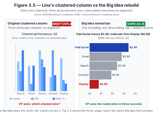
- The Big Idea determines the encoding. Once the Big Idea is «Paid Social returns $3.40 per marketing dollar; reallocate Q4 spend from Display, which returns $0.80», three of the four columns in the source data drop out of the chart. Leads, cost per lead, and conversion rate are inputs to ROMI, not competitors for the audience’s attention. The right chart carries one encoding because the Big Idea carries one argument.
- Sort order carries the argument. Descending by ROMI puts Paid Social at the top and Display at the bottom — the two channels the Big Idea names. Alphabetical sort or original-input order would bury the argument in a five-bar list. The sort is a decision, not a default.
- Accents are the two names the sentence uses. Paid Social and Display are accented because they are the two channels the reader has to see. The middle three channels are visible (context matters), rendered in a muted treatment (they are not the argument), and left unlabelled beyond their ROMI value (the eye does not need help finding them).
- The title is the Big Idea, verbatim. Not «Channel ROMI, Q3» or «Marketing performance by channel». The title asserts the claim the chart proves, and the chart’s job is to make the claim visually inspectable in three seconds.
Why the clustered column fails. Three metrics per channel on three incompatible axes forces the reader to read the chart three times — once per axis — and then compose the answer to the VP’s question in their head. That composition step is where the failure lands: some readers will get to ROMI implicitly, most will not, and none will get there in the three seconds the audience gives the chart before the meeting moves on. Chapter 3 walks the discipline in The Big Idea test.
Inspect the numbers. The five-channel dataset is available as a flat CSV so you can rebuild either chart in your own tool. Download lina-channel-romi.csv · Dataset README and schema.
Try this activity — write the Big Idea before the chart
This activity walks the Chapter 3 discipline against the M365Marketing dataset. Total time: 30–45 minutes.
-
Pick the audience-question. Open the datasets index and browse M365Marketing (need to set up Power BI first? see Getting Started). Pick one audience-question from the following short list: (a) which marketing channel drove the highest Q3 pipeline contribution? (b) has organic-search pipeline growth stalled? (c) how does paid-social CAC compare to the target set at Q1 planning?
-
Write the Big Idea cold. Before opening the dataset, write a one-sentence Big Idea you expect the data to support, applying the four constraints from Ch 3 (one sentence, specific, action-implying, backed by a number). Write the sentence on paper or a sticky note. Do not build the chart yet.
-
Now open the data and check. Query the dataset for the number your Big Idea implies. Does the data support your predicted Big Idea? Three possible outcomes: (a) the data supports it — build the chart to argue it; (b) the data partially supports it — rewrite the Big Idea to match what the data does say; (c) the data contradicts it — consider whether the surprising result is itself the argument worth arguing, or whether you were asking the wrong question.
-
Build the chart against the final Big Idea. Only now open the visualization tool. Compose the chart to argue the Big Idea directly — the Big Idea goes verbatim into the chart title. Use one of the three framings (comparison / change / distribution) as the composition’s tension act. Ch 4’s chart-family taxonomy is the next chapter’s discipline; pick the family that fits the framing (comparison → sorted bar; change → line; distribution → histogram or box plot).
-
Run the single-sentence takeaway test. Screen-share the chart with a colleague who has not seen your Big Idea. Ask: «What is this chart telling you in one sentence?» Their sentence should match your Big Idea. If it does not, the chart failed — not because the colleague is wrong but because the argument did not land.
-
Reflect (three prompts). Write one sentence in response to each:
- Did your cold Big Idea survive contact with the data? What did the data force you to change?
- Which of the three framings did the final Big Idea use, and why?
- What did the colleague’s one-sentence takeaway reveal about the gap between authored argument and read argument?
The reflection is the activity’s payoff. Skipping it turns the exercise into paperwork.
Optional extension: repeat the activity on a chart you shipped last quarter. Write the Big Idea you would have written before building it, and compare to the chart you actually shipped. The gap is where the discipline would have caught you.
Related site resources
- Datasets: M365Marketing and the other teaching datasets the activity above runs against. Each ships with a SCHEMA.md that names the deliberate imperfections you will run into.
- Chart Gallery: once the Big Idea is written and the framing chosen, the gallery is where you pick the family. Ch 4 pairs with the gallery directly; Ch 3 is what gives the reader the reason to consult it.
- Chapter 2 companion: the BRD discipline the Big Idea sits inside. The Ch 3 «audience-question» step draws on the Ch 2 four-questions authoring pass.
- Chapter 4 companion: the next chapter — matches the framing chosen here to a chart family.
- Appendix E — BRD Field Guide Resources: the completed exemplars include Big-Idea sections that show the pattern in production.
Cited in the book
Chapter 3’s bibliography lives in the book’s Appendix C (living version in errata). The chapter’s operative references:
- Knaflic, C. N. (2015). Storytelling with Data: A Data Visualization Guide for Business Professionals. Wiley. The reference work for the Big-Idea and the three-act arc; the chapter operationalizes both as testable working constraints for business analytics.
- Kirk, A. (2024). Data Visualisation: A Handbook for Data Driven Design (3rd ed.). SAGE. The framing on editorial intent and chart-purpose alignment the chapter builds on.