Companion to Chapter 1. Chapter 1 opens the book with the thesis: internalize hand-built visualization discipline first; layer AI direction on top second. The reason is Priya's Tuesday night — a plausible-looking dashboard she cannot defend, produced by Copilot in seconds, staring back at her from the study-room screen because she has no rubric to hold it against. This page carries what the book cannot: curated further reading beyond Appendix C on the cognitive science of automation bias and the perceptual foundations of visualization, a five-question self-check quiz on the plausible-looking-output trap, and a hands-on activity that walks the reader through reading a Copilot-generated chart against the Part I principles.
Use the further reading to understand why plausible-looking output survives review. Use the quiz to check whether Chapter 1's five load-bearing concepts have moved into working vocabulary. Use the activity to feel the competence gap the chapter names — the moment when a chart looks fine and you cannot say why.
Further reading
Books, articles, and papers beyond the book's own bibliography (Appendix C, updated in errata). These extend the chapter's two central threads — the cognitive-science mechanism behind the plausible-looking-output trap, and the empirical basis of the Cleveland–McGill accuracy hierarchy — into the primary literature and adjacent practitioner writing.
- Parasuraman, R., & Manzey, D. H. (2010). «Complacency and Bias in Human Use of Automation: An Attentional Integration.» Human Factors, 52(3), 381–410. The paper the book cites for the complacency-bias mechanism. Reviews decades of empirical work in aviation, medicine, and process control showing that operators under-monitor automated systems precisely when they appear to be working well. The chart-shaped version of the same trap is what Ch 1 names as plausible-looking output. Available via doi.org/10.1177/0018720810376055 (paywalled at the journal; many university libraries carry it).
- Cleveland, W. S., & McGill, R. (1985). «Graphical Perception and Graphical Methods for Analyzing Scientific Data.» Science, 229(4716), 828–833. The original empirical study behind the accuracy hierarchy the chapter builds on. Cleveland and McGill measured error rates as subjects compared values across encoding types; the ranking (position on a common scale » length » angle » area » color saturation) has been replicated many times since. Foundational reading if you want to understand why the Ch 4 chart-family taxonomy is not a matter of taste. Available via doi.org/10.1126/science.229.4716.828.
- Munzner, T. (2014). Visualization Analysis and Design. CRC Press. The closest thing to a canonical academic textbook in the field; the source of the augment-vs-replace framing the chapter uses to justify why visualization is the right kind of AI-adjacent artifact. Companion site with slides and figures at cs.ubc.ca/~tmm/vadbook/. Read Chapter 1 (What’s Vis?) for the frame, Chapter 5 (Marks and Channels) for the perceptual foundations.
- Mollick, E. (2024). Co-Intelligence: Living and Working with AI. Portfolio. A short, well-argued book on how to work productively with generative AI without abdicating judgment. Mollick (Wharton) coined the «jagged frontier» framing — the model is superhuman at some tasks and dangerously wrong at adjacent ones. The competence gap the chapter names shows up in his empirical work with knowledge-worker experiments. Newsletter (weekly) at oneusefulthing.org.
- Cairo, A. (2019). How Charts Lie: Getting Smarter about Visual Information. W. W. Norton. A short, accessible book on reading charts critically — exactly the discipline plausible-looking output defeats. Cairo works through published charts that read as authoritative and are not. Useful complement to Ch 1 because it trains the eye on the reader’s side of the same trap Priya fell into on the author’s side. Author’s writing hub at thefunctionalart.com.
Last curated: 2026-07-18. Reviewed quarterly. Suggestions welcome via the errata page.
Self-check quiz
Five questions on the chapter’s load-bearing concepts. Answer them out loud before opening the reveal — if you can name the answer without prompting, the concept has moved into reflex. If not, the concept is still in working memory, which is the state where it decays fastest.
-
Q1. Chapter 1 names the category of chart failure Priya’s dashboard falls into. What is it called, and why is it the dangerous middle zone (as opposed to a chart that is obviously broken)?
Show answer
Plausible-looking output. The chart reads correctly at first glance — the axes are labeled, the colors are clean, the numbers add up — but it fails principle-check on inspection: an auto-scaled axis that exaggerates variance, an alphabetical sort that buries the load-bearing category, a KPI card with no comparison. Obviously broken charts trigger vigilance and get fixed. Obviously well-designed charts pass on their merits. Plausible-looking output is the middle zone that survives review unexamined because nothing about it announces itself as a problem.
-
Q2. The chapter grounds the plausible-looking-output trap in a documented cognitive-science mechanism. Name the mechanism, its discoverers, and the original domain of study.
Show answer
Complacency bias, from Parasuraman and Manzey (2010), studying automation in aviation, medicine, and process control. The mechanism: human operators reliably under-monitor automated systems precisely when the automation appears to be working well. The lack of visible failure signals means vigilance does not engage, and errors survive the review process because they never triggered a review. Plausible-looking output is the chart-shaped form of the same trap.
-
Q3. The chapter names the «competence gap AI has widened.» What two skills has AI decoupled that were once bundled, and why does the decoupling matter?
Show answer
AI has decoupled production from judgment. Before Copilot, producing the chart was the act of judging it — every choice (chart type, axis, color, sort order) was a choice the analyst had to make and defend. Copilot compresses the production time from an hour to eleven seconds but does not compress the judgment time. The chart appears without the choices, and the analyst is left to evaluate an artifact they did not build, in a design language they may not speak. The competence gap is the space between «anyone can ship a chart» and «few can defend one.»
-
Q4. Name the Cleveland–McGill hierarchy of visual encodings, top (most accurate) to bottom (least accurate), and give one example chart type per level where the encoding actually shows up.
Show answer
Position on a common scale — bar charts (bars share a baseline). Position on non-aligned scales — small multiples (each panel has its own baseline). Length — unaligned stacked bars. Angle or slope — slope graphs; pie slices. Area — bubble charts; treemaps. Volume or curvature — 3-D bars. Color saturation or hue — heatmaps that encode magnitude. Cleveland and McGill (1985) established the ranking empirically; it has been replicated many times since. The ranking is not a matter of taste — it is how the human visual system processes information.
-
Q5. The book’s structural claim is «principles first, AI later.» If a reader inverted the order — learned AI direction first and back-filled principles — what specific problem would they hit, and where does the chapter show them the answer?
Show answer
They would be left unable to review Copilot’s output because they have no rubric to hold it against — they are Priya on Tuesday night. The chapter shows the failure mode in the opening study-room scene: a plausible-looking dashboard, an analyst who can describe what is on the screen but cannot defend it, and no way to close the gap because the principles that would name the defects (Ch 4 chart selection, Ch 5 focus, Ch 2 context) were never internalized. Principles-first sequencing is not a moral preference; it is the pedagogical order that makes Part II’s AI-direction discipline defensible instead of decorative.
Priya’s dashboard, up close
The dashboard below is the one Priya was staring at — the four visuals Copilot produced from the prompt «build a dashboard about Q3 sales for the leadership meeting». Every number reconciles: monthly, regional, and product breakdowns all roll up to the same $42.7M Q3 total, so the visual defects are decisions, not arithmetic mistakes. The four red badges map to the four diagnoses Chapter 1 walks through.
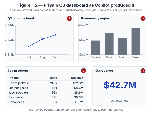
- Panel 1 — Line chart, auto-compressed axis. The y-axis was auto-scaled to
$13.5M–$15.0M, a spread of$1.5Maround the actual monthly range of$13.92M–$14.50M. On that compressed axis, a+4.2%Jul-to-Sep climb reads as a nearly40%climb of the plot area. The chart is technically correct and visually deceptive. - Panel 2 — Region bars, alphabetical and comparison-blind. Regions are ordered Central, East, South, West. Nothing on the chart names underperformance. Sorting bars by value ascending would surface Central first — and Central is beating its plan. South, which came in roughly eighteen percent below plan, sits third from the left as a middling bar. The defect is the missing plan-variance measure, not the sort order.
- Panel 3 — Top products, margin-blind. Denim jackets sit at the top with
$12.25Mand245kunits. Nothing in the table communicates gross margin. Leather goods sit second on revenue but earn the highest gross-margin dollars in the set; the Q4 inventory push based on this table would prioritise Denim jackets over Leather goods and get the decision backward. - Panel 4 — KPI card, comparison-free. A number without a comparison is not a story. Is
$42.7Mgood, bad, on plan, above forecast, below last year? The card cannot answer because it has no second number.
The corrected dashboard, same underlying data. One title, one measure, one comparison, one sort order — four decisions changed. The leader now sees Jul–Sep growth on an honest axis, South’s plan miss in the eye’s first landing zone, Leather goods at the top of the inventory-push list, and the Q3 headline with its Q2 baseline in the same card.
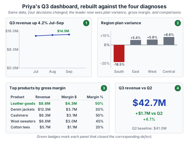
This is not the only defensible redesign. A trend chart teaching magnitude might keep the zero baseline; one teaching pace of change might keep a labelled focused range. A region view for a leader who does not care about plan variance might do something different again. What every defensible redesign has in common is that a working analyst can name each choice against a Part I principle and defend it.
Inspect the numbers. The full aggregate dataset is available as a flat CSV so you can rebuild the dashboard yourself in Power BI, Excel, or any tool that reads three columns. Download priya-q3-sales.csv · Dataset README and schema.
Try this activity — read a Copilot chart against the Part I principles
The activity below runs the same discipline against a chart you build yourself. Total time: 30–45 minutes.
-
Generate the artifact. Open Power BI Desktop against the CloudRevenue dataset (need to set up Power BI first? see Getting Started). In Copilot, type one prompt with no elaboration: «show me Q3 revenue by region.» Accept whatever chart Copilot returns. Do not iterate. Do not adjust. This is the cold-generation state Priya starts from.
-
Give yourself thirty seconds. Without opening any other tab, look at the chart for thirty seconds. Write one sentence answering: «What is this chart telling me?» Then close the file.
-
Now load the rubric. Open the four Part I principle chapters’ recaps — you can use the book’s Chapter recap tables (Ch 2 context, Ch 4 chart selection, Ch 5 focus and decluttering, Ch 6 color, type, and accessibility). Print or open on a second screen.
-
Reopen the Copilot chart and read it against each principle in order. Not «does it look right?» but «what specific Part I principle would name each design choice as pass or fail?»
- Ch 2 (context): what is the BRD this chart implicitly answers — audience, decision, question, comparison? Is the comparison one of the five reference frames, or is it just «the numbers»?
- Ch 4 (chart selection): which chart family did Copilot pick? Does the family fit the question, or is it the default failure mode for that question shape (clustered columns for a comparison, pie for a composition, stacked area for a trend)?
- Ch 5 (focus and decluttering): does the chart use one pre-attentive attribute to direct the eye, or does everything shout equally?
- Ch 6 (color, type, and accessibility): what would this chart look like under deuteranopia simulation? What would it look like in grayscale?
-
Rewrite your thirty-second sentence. After the principled read, write a second one-sentence answer to «what is this chart telling me?» Compare the two sentences. If they say the same thing, the chart passed principle-check. If they disagree — if the principled read surfaced a claim the cold read missed, or a claim the cold read imagined that the principled read cannot support — the chart is plausible-looking output. Note which principle caught the gap.
-
Reflect (three prompts). Write one sentence in response to each:
- Which Part I principle caught the biggest gap between your cold-read sentence and your principled-read sentence?
- Which principle would you have skipped if you had not been walking a checklist?
- How long would it have taken to notice the gap without the rubric?
The reflection is the activity’s payoff. Skipping it turns the exercise into paperwork.
Optional extension: repeat the activity against a dashboard you shipped in the last quarter (yours or a colleague’s). The gap between cold-read and principled-read for a shipped artifact is usually where the review process failed — and where the next iteration can improve.
Related site resources
- Priya’s Q3 sales dataset: the synthetic apparel-retailer scenario behind the two dashboards above — aggregate rollups plus the six-product breakdown as a flat CSV.
- Chapter 1 — Practice-on-your-own solutions: worked answers to the two problems in the print book’s Practice section.
- Chart Gallery: the gallery is where the Part I principles land in practice. Chapter 4 pairs with it directly; Chapter 1 gives the reader the reason to consult it before accepting a Copilot default.
- CloudRevenue dataset: the synthetic subscription-revenue dataset the activity above runs against. 8 product families × 247 tenants × 36 months, with three deliberate imperfections that make the principle-check discipline non-trivial.
- Chapter 2 companion: the next chapter in the principles-first sequence; introduces the BRD discipline the Ch 1 activity above quietly relies on.
- Appendix E — BRD Field Guide Resources: the eight-section BRD template and completed exemplars. Useful for the Ch 2 pairing above; also useful as the «what would have been the BRD?» check in the Ch 1 activity’s Ch 2-context step.
Cited in the book
Chapter 1’s bibliography lives in the book’s Appendix C (living version in errata). The chapter’s operative references:
- Cleveland, W. S., & McGill, R. (1985). «Graphical Perception and Graphical Methods for Analyzing Scientific Data.» Science, 229(4716), 828–833. The empirical basis for the accuracy hierarchy.
- Parasuraman, R., & Manzey, D. H. (2010). «Complacency and Bias in Human Use of Automation.» Human Factors, 52(3), 381–410. The cognitive-science mechanism behind the plausible-looking-output trap.
- Munzner, T. (2014). Visualization Analysis and Design. CRC Press. The augment-vs-replace framing the chapter uses to justify why visualization is the right kind of AI-adjacent artifact.